Alfredo
Categories
Branding, Visual identity
Client
Alfredo
Services
Branding Art & Design Direction
Year
2025
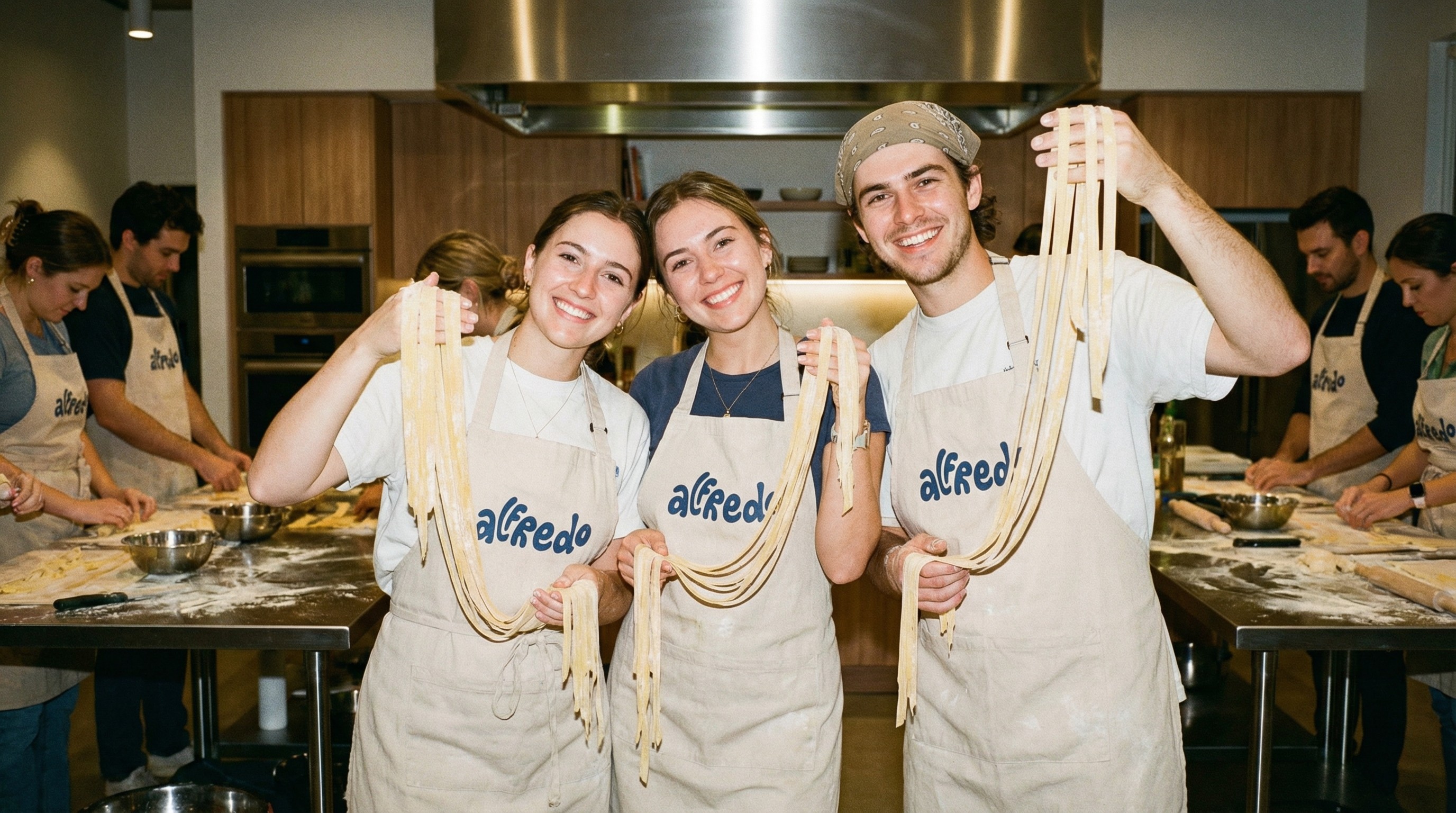
Alfredo is a fresh pasta masterclass rooted in the traditions of Piedmont, built around a hands-on and intimate learning experience.
The goal was to create a brand that could feel warm and approachable, while preserving a strong sense of authenticity and craft.
It needed to reflect both the human side of the experience and the cultural depth behind it, without becoming nostalgic or overly decorative.


The identity was designed to balance heritage and simplicity, drawing from the gestures, tools and materials of traditional pasta-making.
A custom logotype becomes the central element, expressive yet grounded, paired with tactile visuals and a restrained color palette.
The system was kept intentionally minimal, allowing each element to feel considered and coherent across different applications.
The result is a visual language that feels familiar, immediate, and quietly distinctive.

The brand translates naturally across physical and digital touchpoints, from packaging to environmental graphics and social content.
Its strength lies in its ability to remain consistent while adapting to different contexts, always maintaining a clear and recognizable presence.
The overall result is a brand that feels human and grounded, capable of expressing both the experience itself and the values behind it.


